
Have you ever sat through a meeting and endured the pain of a text-heavy slide that the presenter then reads verbatim the text on the slides?
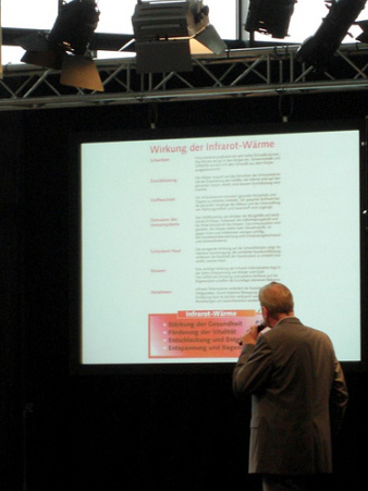
(Image from Flickr/CreativeCommons)
This sort of drivingly dull exercise is how the vast majority of academic presentations go. The use of presentation software, most often the Microsoft-branded Powerpoint, ends up being a slow, painful experience widely known as “death by powerpoint.”
My own personal (anti-)favorite version of this is the text-filled slide, built using one of the standard, awful templates that come packaged with Powerpoint (PPT), that the presenter then *reads* to the audience with their back turned to everyone in the room while they look at the slides (as in the image here). This is not only insulting (I’m not an idiot – but I feel like one when you read to me) it’s also a very ineffective way to communicate a message. People can’t actually read and listen at the same time, or – they can, but they end up getting less of what you’re trying to get across to them.
To avoid this, academics doing presentations need to think differently about their use of slides. A much more effective use of slides is to consider them visual illustrations of the key points you want to make. Begin to think of your presentation as a “slide deck” filled with images and a little text, rather than a way to dump a huge bunch of text.
A Brief Introduction for Academics who Want Move Beyond Death by Powerpoint
There’s a great book (+ website) called “Beyond Bullet Points” that really shifted my thinking about how to use PPT. The author recommends thinking about your PPT presentation as a screenplay. He’s talking mainly to people in marketing, but there are plenty of applications to the academic world.
I shamelessly lifted that title for a faculty development workshop I did at Hunter a few summers ago. That’s been archived as an online presentation (with audio) here.
At that link, scroll all the way down and click on the link above my name. [Fair warning: when you click that link to my presentation it will auto-magically re-size your browser window. ]
Creating an Image-Driven Presentation
It can be a big conceptual shift to leave behind the seeming security of a PPT template and step out into the uncharted territory of creating an image-driven presentation. But, it gets much easier once you get the hang of it. And, the pay off is a slide deck that really “wow’s” an audience and gets your message across, rather than puts them to sleep. Here are some steps:
- Convey an Idea Visually – Take one of your existing slides with all those bullet points and text on it and ask yourself: what’s the central idea I’m trying to get across here? Then ask yourself: what would a picture of that idea look like? These are the central questions for creating an image-driven presentation.
- Insert > Duplicate Slide – One of the handiest tips for creating an image-driven presentation is to make good use of the command “Insert > Duplicate Slide.” Once you’ve created an image slide that you like with a small amount of text (one or two words), then insert 10 or so duplicates of that slide and change the text. For the audience, this creates a visual impact closer to a movie.
- Use the Best Quality Image You Can – Image quality is so a perennial problem. Once you take a snapshot and blow it up to presentation size to fill a screen, you can have an image that looks grainy (pixelated) and washed out. So, finding high quality (high pixel count) images with good composition can sometimes be a challenge as well. This is why for professional presentations people often turn to places like iStockphoto (http://www.istockphoto.com/). These are high pixel, professional photos that you pay for. There are some real downsides to these (beyond cost). As more people use them, these ‘stock’ images get used by multiple people and they become easily recognized as stock images. For our purposes, they’re problematic because the photos there have very few people of color.
- Only Use Images that You Have Permission to Use – A good many of the images you might just “find” on the Internet are copyright protected, meaning someone owns the image and they want to be paid (sometimes a lot) for you to use it. This is where Flickr/creativecommons (http://www.flickr.com/creativecommons) comes in very handy, because those images are licensed as ok for reuse without a fee. The trick becomes figuring out how to come up with the most effective search terms for what you want.
- Roll Your Own – Creating your own images is a great time saver. If I ever get invited to do a super high-stakes talk – like TED Talk – I’d think seriously about having a professional photographer create original images for that talk. I’ve gotten into the habit of doing this myself, taking photos while I’m out in the world that I think will work well for a presentation (even just teaching) that I know will be hard to find online.
Learn from the Best
As with any skill you’re trying to master, it’s useful to learn from people who are really accomplished at whatever you want to do and figure out how they do it. It’s the same with presentation skills. Fortunately, there are quite a few exemplars out there from whom we can learn.
I sometimes think that Al Gore won a “Best Documentary” Oscar and the Nobel Prize for having a really, really good slide deck. Watch “An Inconvenient Truth” again and you’ll note that it’s really a film about creating a slide presentation.
What you don’t see in the film is that Al Gore also had the help of a design firm, Duarte. The lead at that firm is Nancy Duarte and she’s created a webinar about “Creating Powerful Presentations” that’s available here.
Garr Reynolds is an American ex-pat living in Japan and he has achieved “zen mind” about presentation style. He has some great ideas about professional quality presentation which he regularly shares on his blog.
If you haven’t lost an afternoon delving into the fabulous world of TED Talks, you really should. The people who present here are selected because they’re smart people, talking for 18 minutes about an idea they’re passionate about, and they’re almost uniformly at the top of their presenting-game. You’ll note the distinct absence of bullet points or standard PPT templates in any of these talks.
Here are a few of my favorites:
* Larry Lessig
* Hans Rosling
* Majora Carter
* Elisabeth Pisani
Spend a few minutes, or a few hours (!), watching these skillful presenters make good use of visual images to convey their ideas. The next time you have to prepare a talk, challenge yourself to move beyond the lowest-common-denominator of bullet points and pre-packaged templates. Your audience will thank you!


Diana Mason / May 15, 2011
Thanks for sharing this, Jessie. I viewed it before giving the keynote address to the International Council of Nurses Conference in Malta on May 5th. It was an extremely well-received presentation and I’m sure getting rid of the “bullets” style helped tremendously.
Diana
/
Pingback: » Death by PowerPoint for Academics Tools + Inspiration / October 12, 2011
/