Avoiding Death by Powerpoint for Academics
Have you ever sat through a meeting and endured the pain of a text-heavy slide that the presenter then reads verbatim the text on the slides?
(Image from Flickr/CreativeCommons)
This sort of drivingly dull exercise is how the vast majority of academic presentations go. The use of presentation software, most often the Microsoft-branded Powerpoint, ends up being a slow, painful experience widely known as “death by powerpoint.”
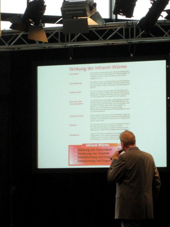
My own personal (anti-)favorite version of this is the text-filled slide, built using one of the standard, awful templates that come packaged with Powerpoint (PPT), that the presenter then *reads* to the audience with their back turned to everyone in the room while they look at the slides (as in the image here). This is not only insulting (I’m not an idiot – but I feel like one when you read to me) it’s also a very ineffective way to communicate a message. People can’t actually read and listen at the same time, or – they can, but they end up getting less of what you’re trying to get across to them.
To avoid this, academics doing presentations need to think differently about their use of slides. A much more effective use of slides is to consider them visual illustrations of the key points you want to make. Begin to think of your presentation as a “slide deck” filled with images and a little text, rather than a way to dump a huge bunch of text.